E.ON – WE-Blog
Early in my agency career, I got the chance to build a visual system from scratch for E.ON's WE-blog. This project taught me how far a strong visual identity can carry a story. The WE-blog is a platform created by E.ON to share stories about environmentally conscious and smart solutions developed in collaboration with cities, architects, and individuals committed to a more sustainable future. Together with its partners, E.ON aims to build a greener, cleaner, and more forward-thinking world.
My Role
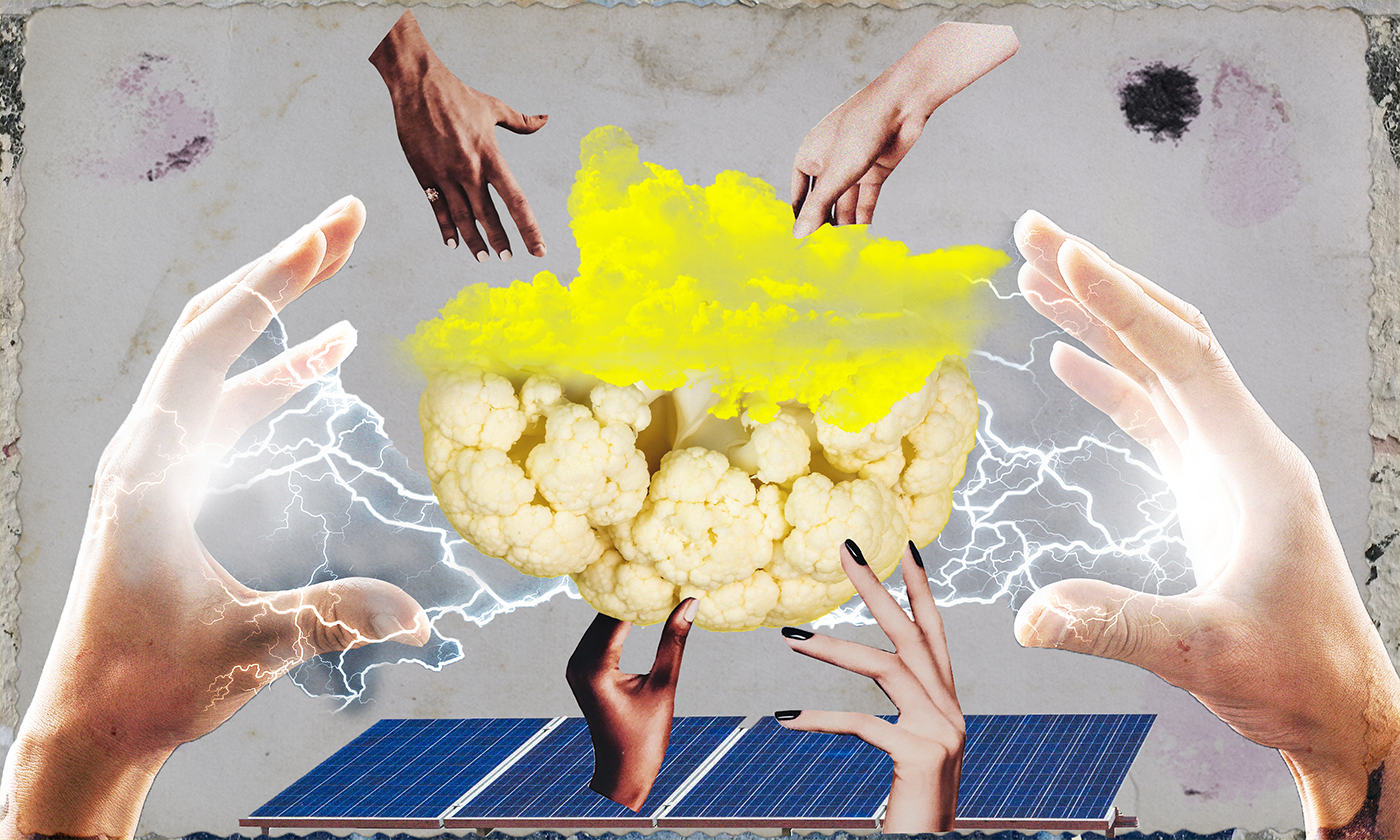
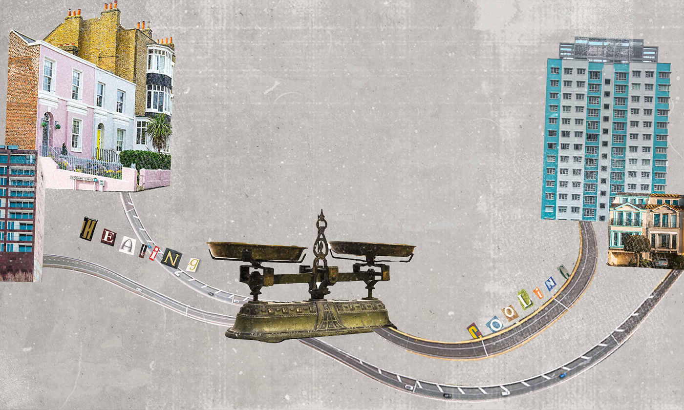
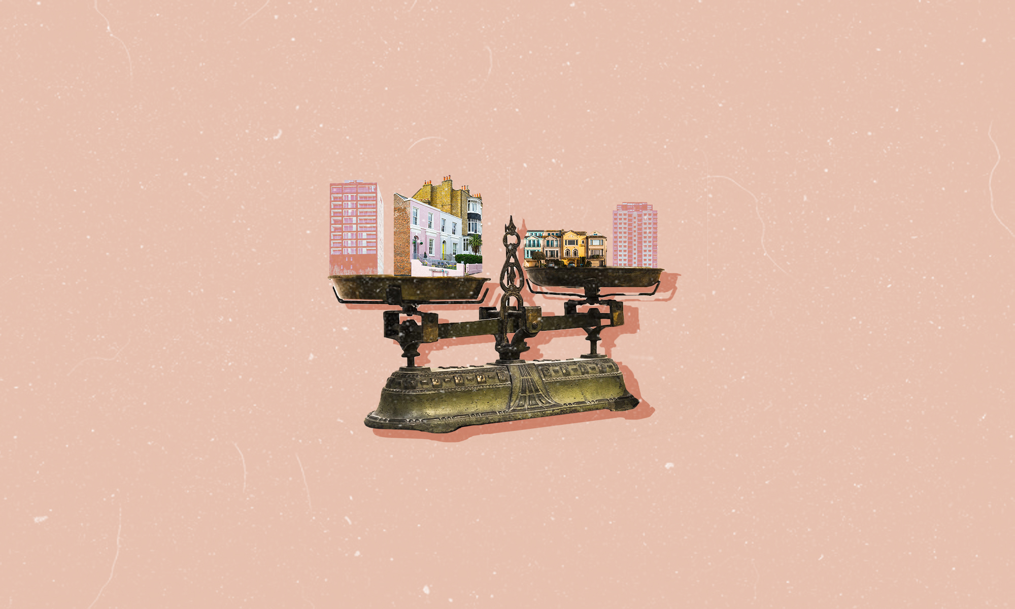
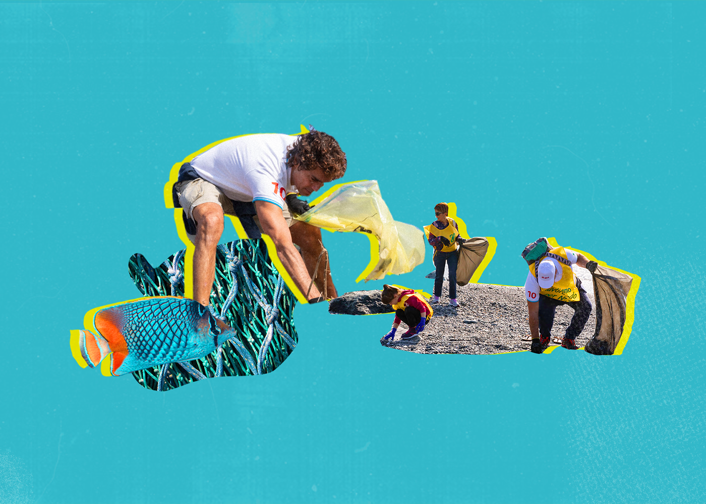
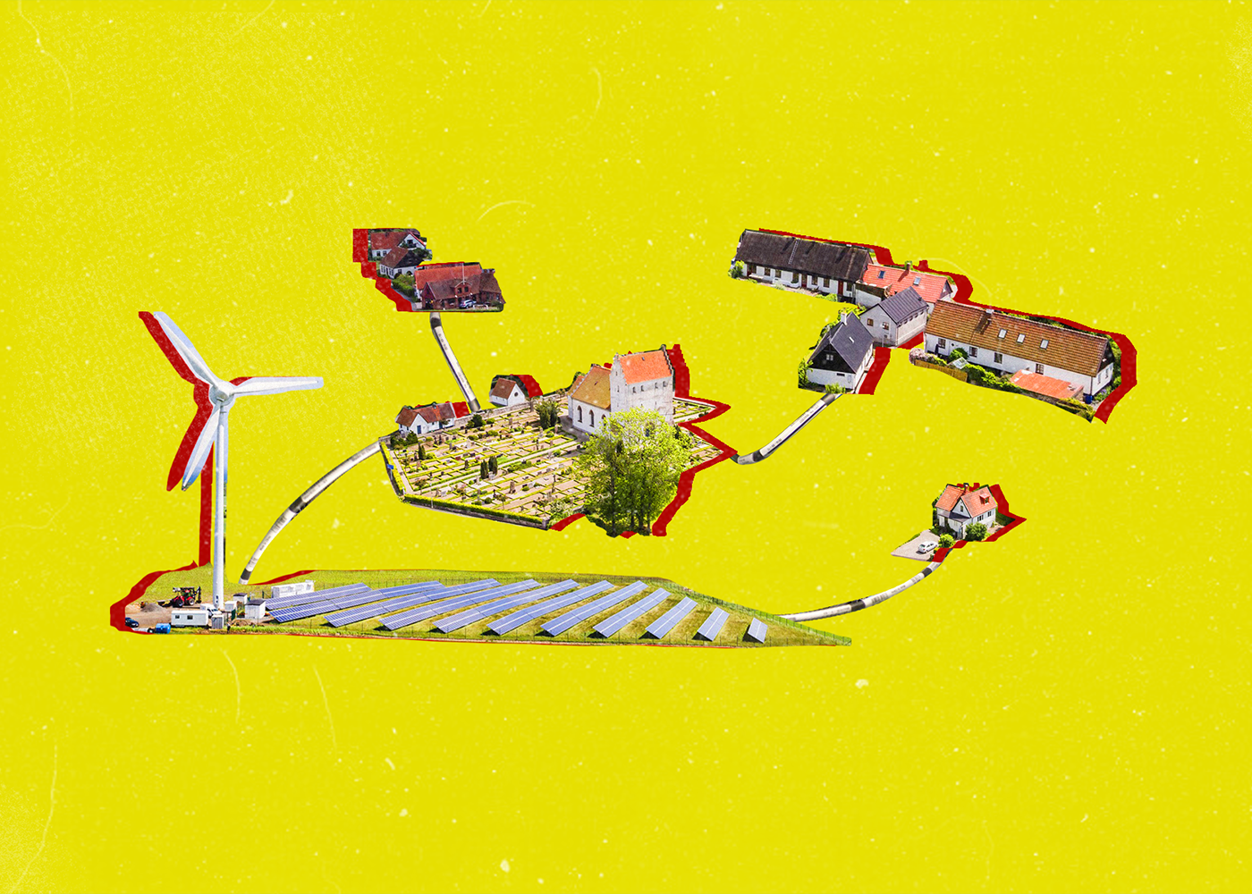
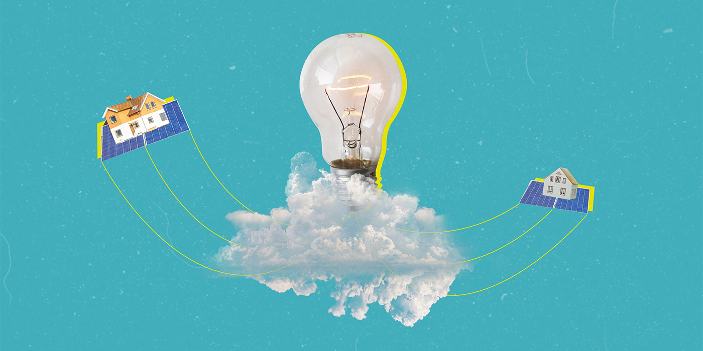
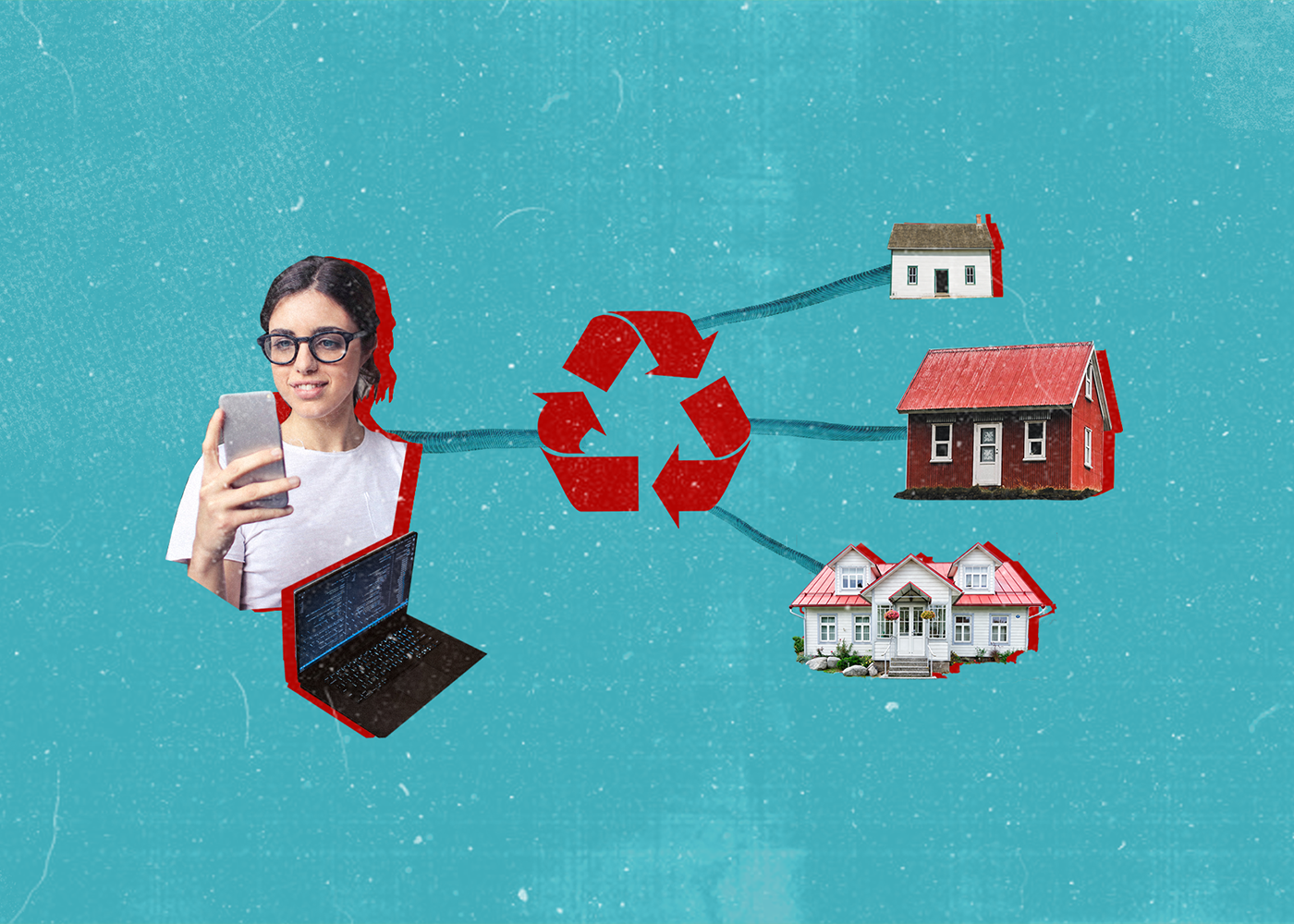
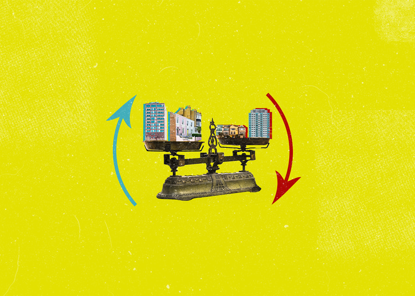
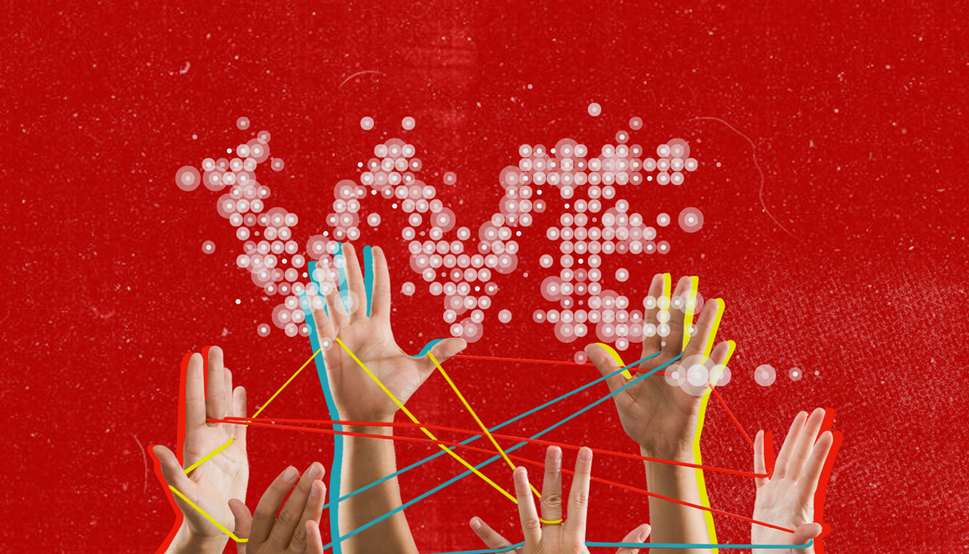
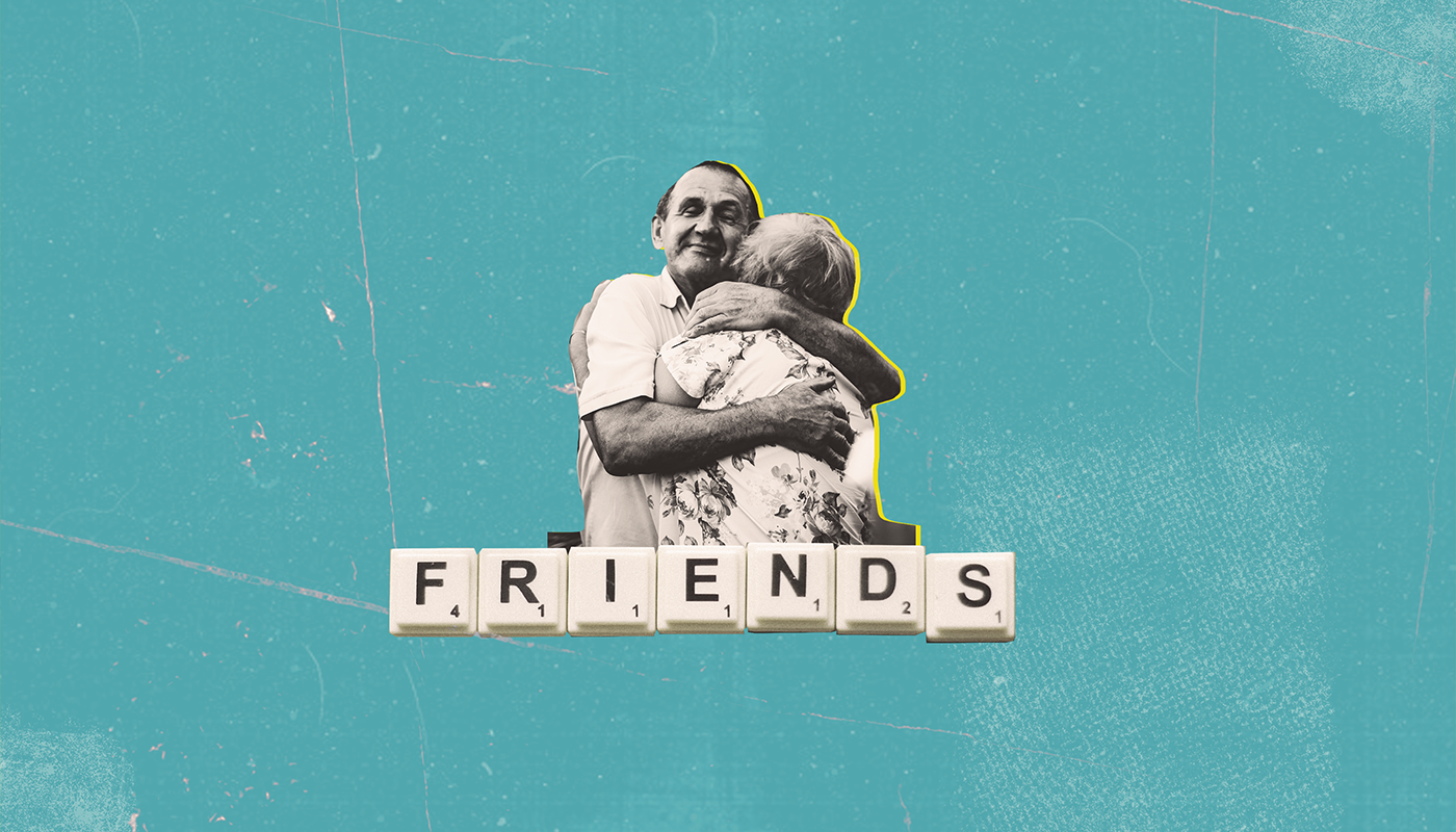
To visually support the storytelling, I developed a collage style that highlights key elements of each WE-Story and shows how they connect to one another. Beyond the collage style itself, I defined the full style guide – color logic, shadow treatment, composition rules, so that the system could be reused consistently across every future WE-Story. The background colors for the collages are taken from the existing E.ON brand palette, creating a clear visual identity and immediate recognition. To complete the look, the shadows of each element are set in an additional brand color, giving the collages more depth and energy.
Learning & Impact
Anchoring every collage in E.ON's existing brand palette gave the series a clear, recognizable identity across very different stories and partners, which was a proof that a flexible visual system still needs firm rules to stay consistent at scale. I love the final result and the dynamic interplay created when the collages are experienced together and on the blog.
Each image shown below links directly to its related article; feel free to explore. The stories are absolutely worth reading.
Earlier Drafts